5.1 Quick Example
Before diving into detail, let’s do a quick example so you can begin to see what is possible with data in R.
As we mentioned in the last chapter, R includes some pre-packaged data sets, which you can access with the data() command.
One of the data sets is Seatbelts, which documents road casualties in Great Britain between 1969 and 1984.
Firstly, we need to convert Seatbelts to a data frame, because it starts out as a “Time-Series”, which we haven’t discussed.
Seatbelts <- data.frame(as.matrix(Seatbelts),
                        date = time(Seatbelts))  # Convert Time Series to data frame
We’ve also added a date column.
Look at the dimensions of the data set with the dim command:
[1] 192 9This shows that there are 192 rows (months), and 9 columns (variables measured each month).
We could also determine the number of rows and columns separately using the nrow and ncol functions.
To view the first few rows of the Seatbelts data frame, use the head command:
This is a good way to learn which variables are being measured (columns) and see some example observations (rows) for each variable. Because these data are included with R, more information about each variable can be found with:
Next, let’s view a summary of each column with the summary function:
 DriversKilled      drivers         front             rear
 Min.   : 60.0   Min.   :1057   Min.   : 426.0   Min.   :224.0
 1st Qu.:104.8   1st Qu.:1462   1st Qu.: 715.5   1st Qu.:344.8
 Median :118.5   Median :1631   Median : 828.5   Median :401.5
 Mean   :122.8   Mean   :1670   Mean   : 837.2   Mean   :401.2
 3rd Qu.:138.0   3rd Qu.:1851   3rd Qu.: 950.8   3rd Qu.:456.2
 Max.   :198.0   Max.   :2654   Max.   :1299.0   Max.   :646.0
      kms         PetrolPrice        VanKilled           law
 Min.   : 7685   Min.   :0.08118   Min.   : 2.000   Min.   :0.0000
 1st Qu.:12685   1st Qu.:0.09258   1st Qu.: 6.000   1st Qu.:0.0000
 Median :14987   Median :0.10448   Median : 8.000   Median :0.0000
 Mean   :14994   Mean   :0.10362   Mean   : 9.057   Mean   :0.1198
 3rd Qu.:17202   3rd Qu.:0.11406   3rd Qu.:12.000   3rd Qu.:0.0000
 Max.   :21626   Max.   :0.13303   Max.   :17.000   Max.   :1.0000
      date
 Min.   :1969
 1st Qu.:1973
 Median :1977
 Mean   :1977
 3rd Qu.:1981
 Max.   :1985
Since each column is numeric, R shows a five number summary (minimum, first quartile, median, third quartile, maximum) and mean for each column.
We learn, for example, that the average number of drivers killed per month is 1670, and that the greatest price of petrol was £0.13 per litre!
Let’s view a histogram of DriversKilled:
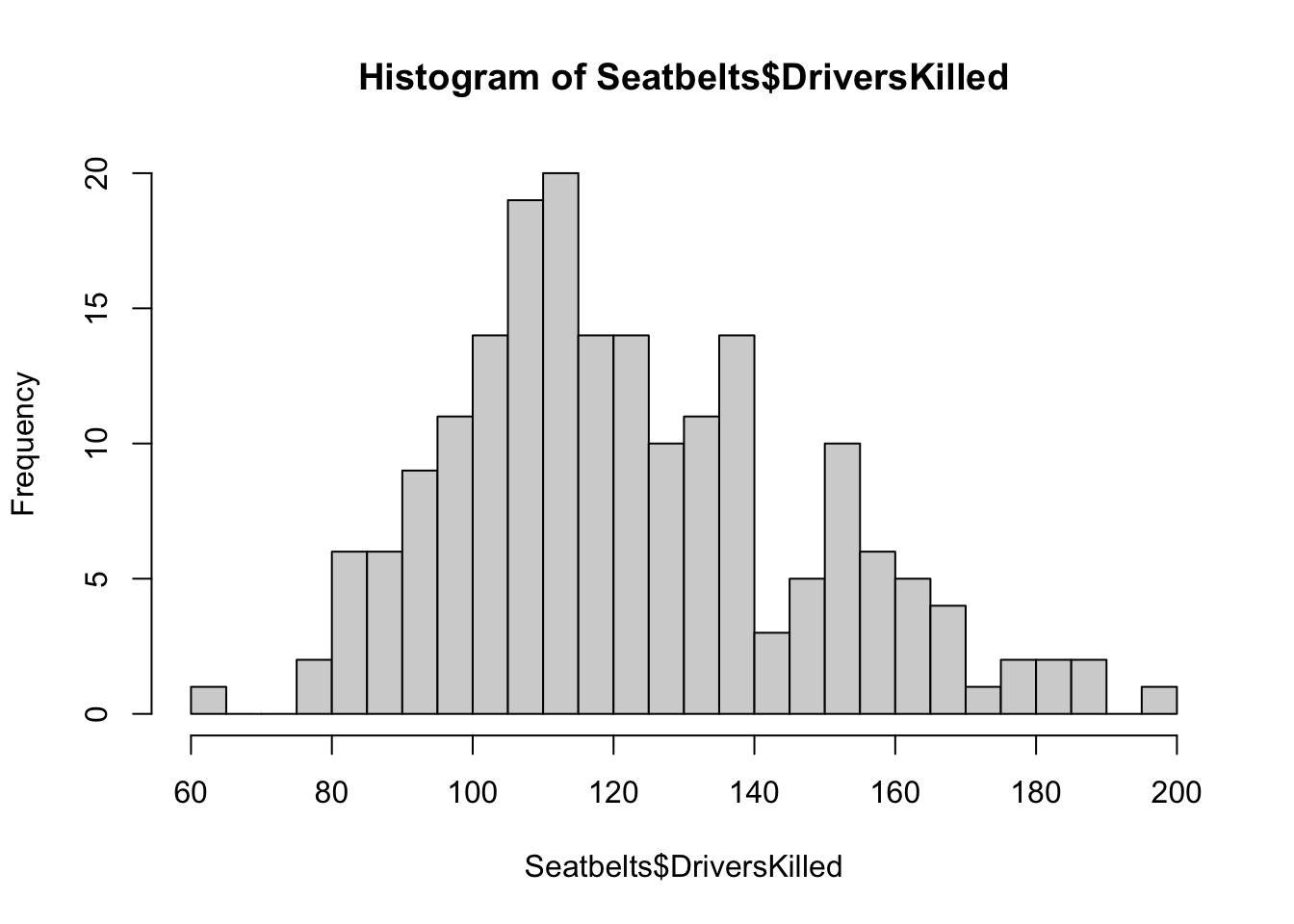
Figure 5.1: Histogram of Drivers Killed in Seatbelt data
We see that in some months, more than 150 drivers were killed! We can calculate how many exactly like so:
[1] 33To investigate the effect of the seat belt law, let’s create a scatter plot of drivers killed against time:
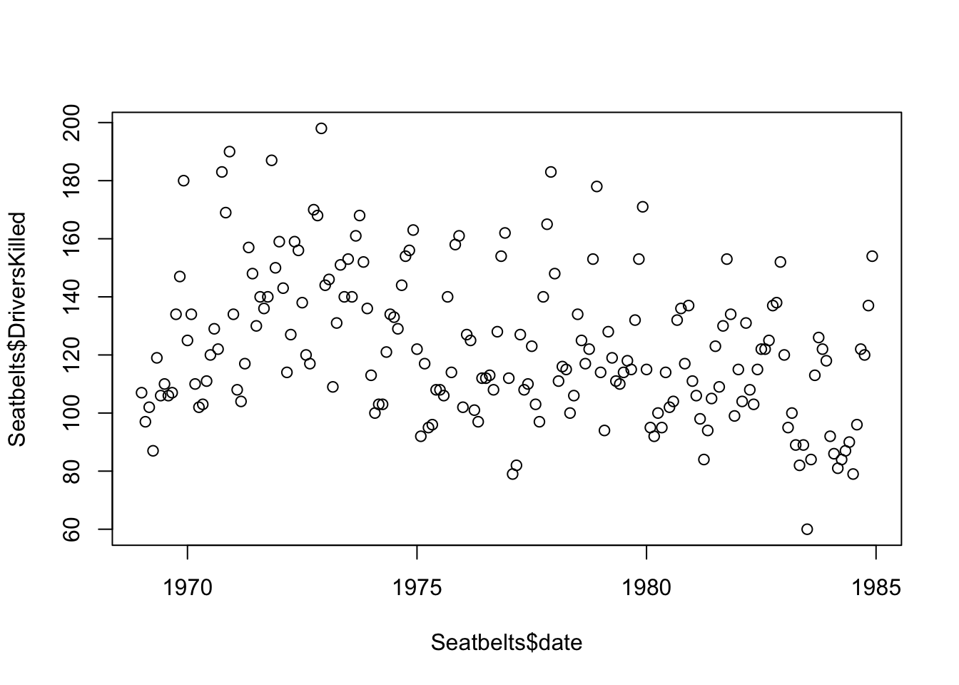
Figure 5.2: UK Seatbelt deaths vs time
By adding a col argument to the plot function, we can color the points based on whether the law was in effect:
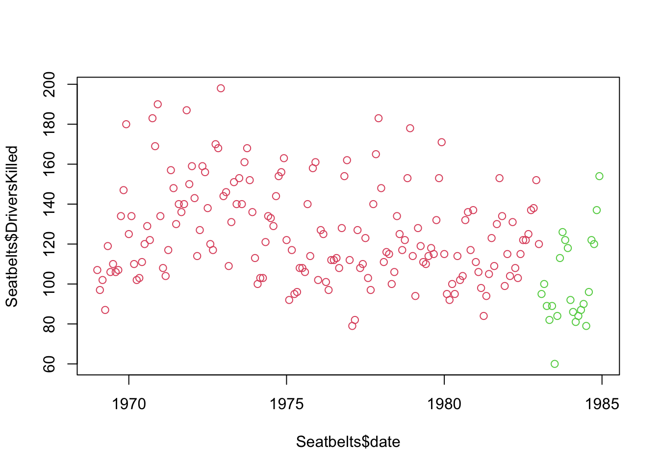
Figure 5.3: UK Seatbelt deaths vs time, red = no seatbelt law, green = seatbelt law
There do appear to be fewer deaths, but there is so much fluctuation in deaths each year that it’s difficult to tell.
Let’s change the x-axis to reflect month of the year instead of date:
plot((Seatbelts$date %% 1) * 12 + 1, Seatbelts$DriversKilled,
     xlab = "Month", col = Seatbelts$law + 2)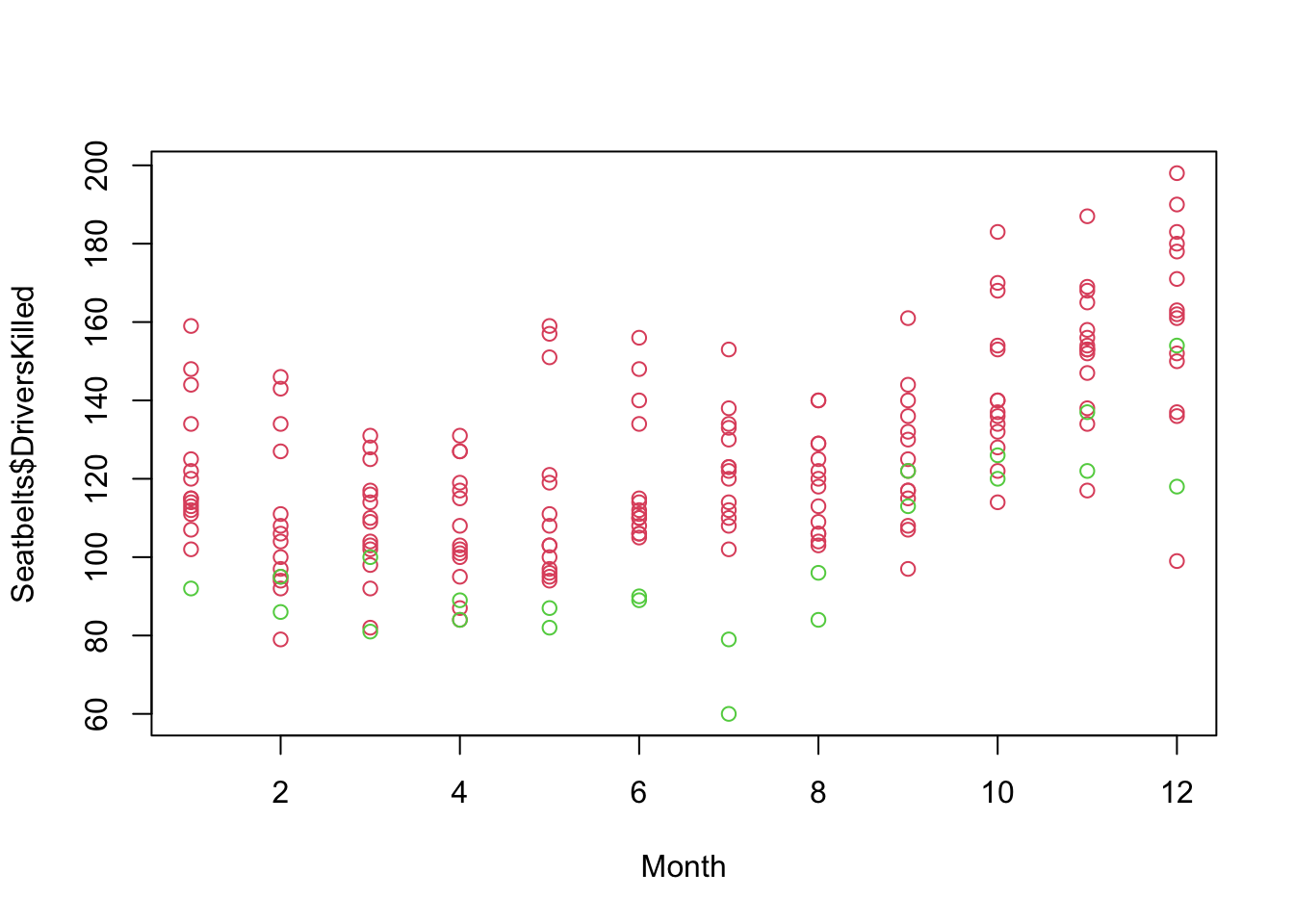
Figure 5.4: UK Driver Deaths vs. Month
This plot shows that there is a clear seasonal effect in the number of deaths with higher deaths occurring in the Fall/Winter compared to Spring/Summer. We can also see that within each month, the traffic deaths after enacting the Seatbelt law are among the lowest.
Another data set included in R is mtcars. Following the
example above, find the dimension of mtcars and have R
print out a summary of each column, then create a scatter plot of fuel
economy (mpg) versus engine displacement. What do you
observe about the relationship between these two variables?
This concludes the quick example. In the rest of this chapter, we’ll talk in more detail about the different steps of working with data, and how to complete them using R!
People often use data in order to answer questions, but often times,
learning about data can generate even more questions than it
answers. Take a moment to think of a question that you have about the
Seatbelts dataset. Do you think the question can be
answered using the data alone? If not, what other sources of data might
be available which can help answer the question?
Any feedback for this section? Click here