4.2 ggplot
In the previous subsection, we outlined how to construct plots in base R. While flexible, base plots are essentially a series of R commands, lacking a universal graphical language which makes it difficult to translate from one plot to another. To fill this void, ggplot was created, built from concepts introduced in Grammar of Graphics in Wilkinson (2012). In essence, the grammer of graphics asserts that every graph is composed of data in a coordinate system where the data are represented by geometric objects (such as points, lines, and bars) with aesthetic attributes (such as color, shape, and size). Furthermore, a graph may contain statistical transformations of the data. These are the ingredients of ggplot, outlined in the following Figure taken from the ggplot cheat sheeet.
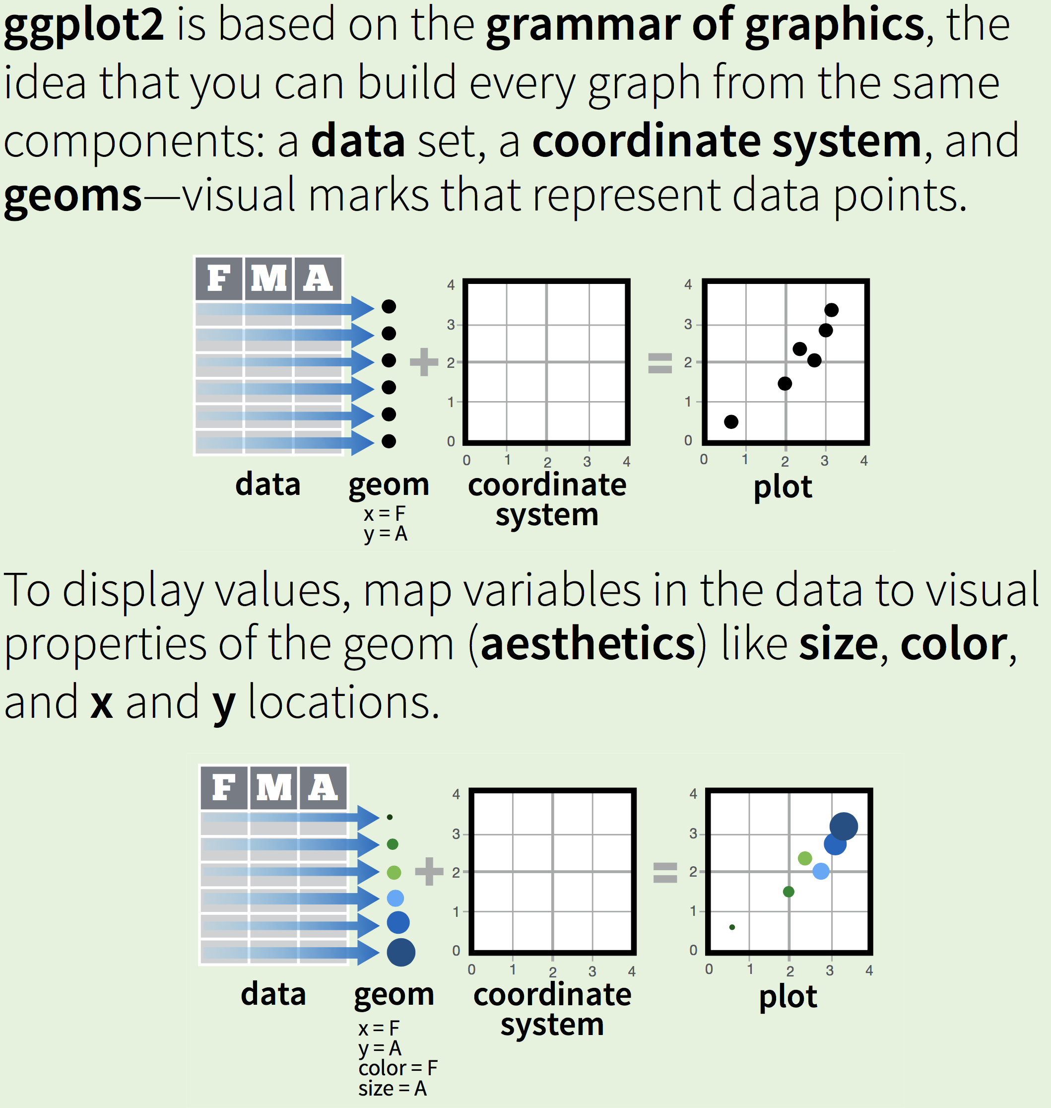
Figure 4.2: visualization of the grammer of graphics
To exemplify the process, let’s create the same scatterplot from the previous subsection. The ggplot function is used to specify the desired map. As arguments, it requires the data set (rush_receive) and the aesthetics. Here, three aesthetics are specified: the variable used for the x-coordinates (receiving_ctch_percent), the variable used for the y-coordinates (receiving_lng), and the color (pos). The color aesthetic assigns a color for each unique value of position. Since there are four positions in consideration, there will be four colors used. Once the data set and aesthetics are specified, we need to specify how to visually represent the data with geometries. Here, we wish to create a scatterplot, so we will use points to represent the data (i.e. geom_point()). Without specifying the coordinate system, the Cartesian coordinate system generated by the x- and y-axis variables is used by default.
p <- ggplot(data = rush_receive,
       aes(x = receiving_ctch_percent,
           y = receiving_lng,
           color = pos)) +
  geom_point()
p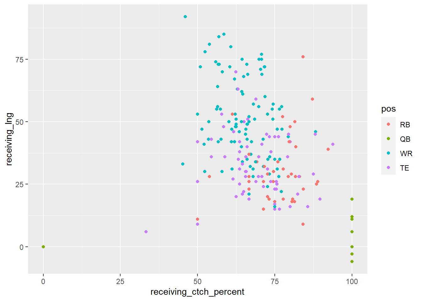
Once the basics of the plot are created, we can then fine tune the scales, labels, and theme. One quick and color-blind friendly option for setting the colors used is with scale_color_brewer which uses color palettes from the RColorBrewer package. Furthermore, the name and breaks of the x- and y-axis can be changed with their respective scales. Since both axes represent continuous quantities we use scale_x_continuous and scale_y_continuous. Titles, subtitles, and captions can be changed with labs. The overall appearance of the graph can be changed with premade themes such as theme_bw or you can create your own using theme. Here, we use theme to move the legend to the bottom of the graph.
p <- p +
  scale_color_brewer('Position', palette = 'Set1') +
  scale_x_continuous(name = 'Catch Percentage (%)') +
  scale_y_continuous(name = 'Longest Catch (yds)') +
  labs(title = 'Longest Catch vs Catch Percentage') +
  theme_bw() +
  theme(legend.position = 'bottom')
p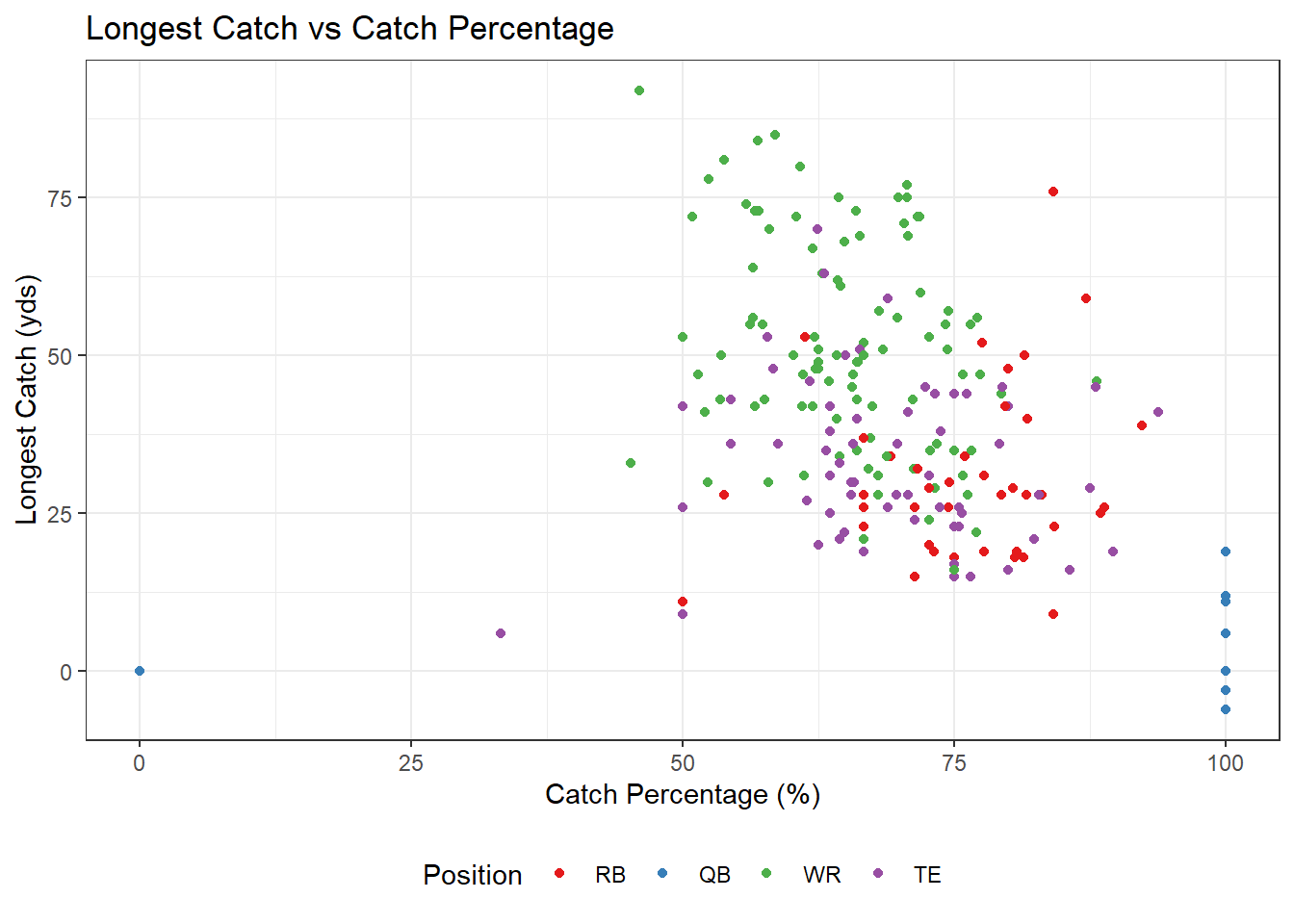
After a graph is created, you can add elements to the graph through layers. Layers can use the same aesthetics as the orignal graph, such as adding a scatterplot smoother for each position:
Or, layers can be defined from different data sets and aesthetics, such as labeling running backs in the NFL who attended the University of Georgia:
uga_rbs <- filter(rush_receive, player %in% c("Todd Gurley",
                                              "Nick Chubb",
                                              "Sony Michel",
                                              "D'Andre Swift"))
p <- p +
  geom_label(data = uga_rbs,
             aes(x = receiving_ctch_percent,
                 y = receiving_lng,
                 label = player),
             size = 2,
             inherit.aes = FALSE)
p + labs(caption = 'Go Dawgs!')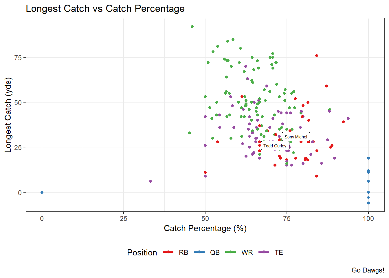
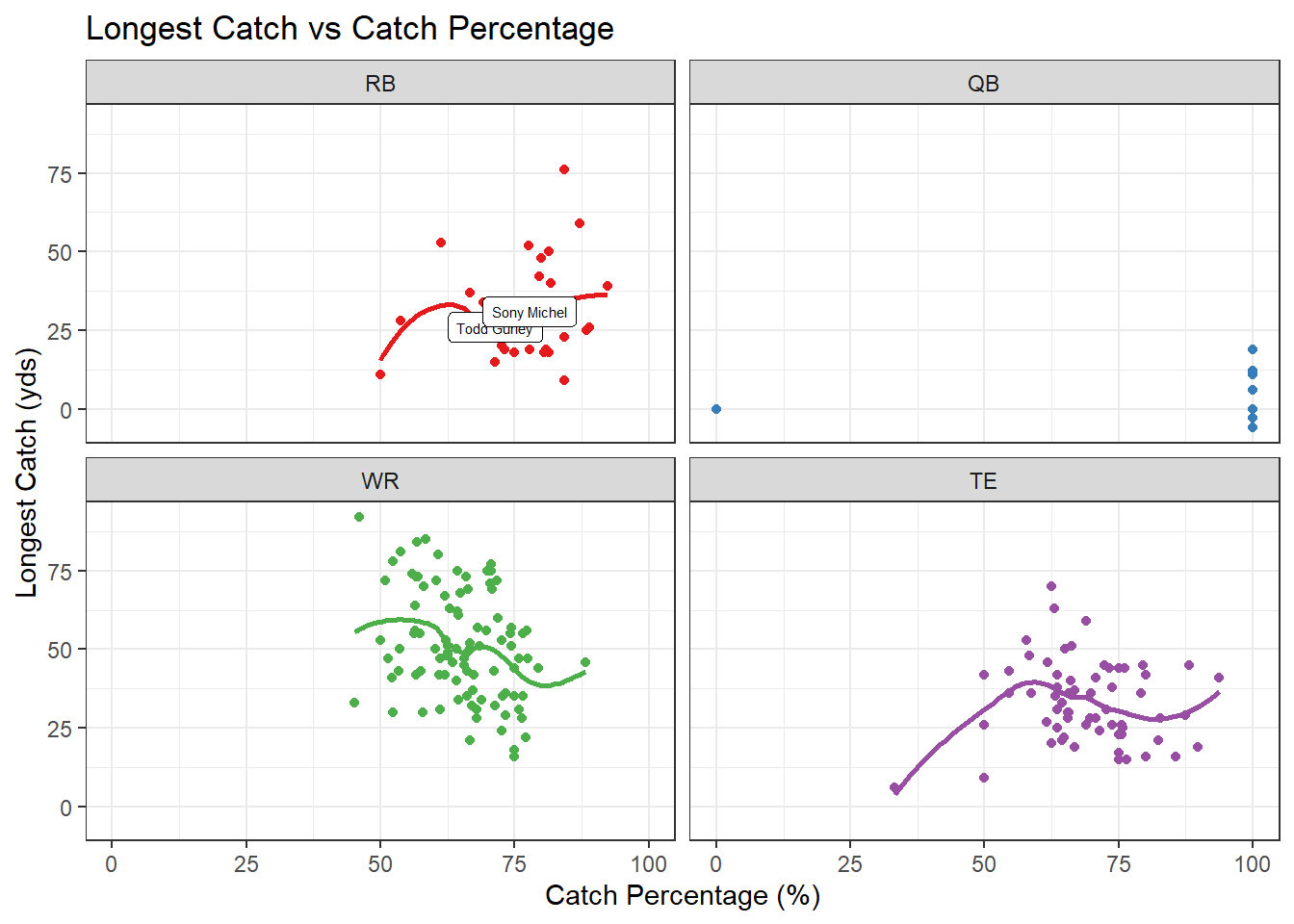
A popular and incredibly useful layer in ggplot is a facet. Facets allow the user to create the same plots for every value of a variable. For example, in the previous scatterplot, we colored the points by the player’s position. Instead, if we wanted a seperate scatterplot for each position, we could apply a facet.
References
Wilkinson, Leland. 2012. “The Grammar of Graphics.” In Handbook of Computational Statistics, 375–414. Springer.